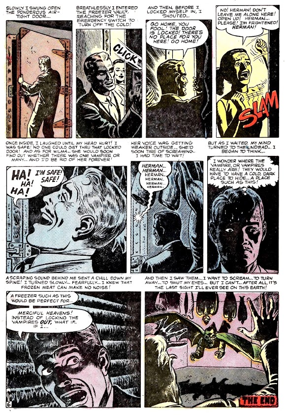
Is everyone getting tired of vampire stories yet? I know I never do, but I can sometimes feel it me bones, and in the air... when a blog theme seems to sort of wear out its full-bodied, warm-blooded welcome. So after today we'll get back to a more macabre mix of precode (and beyond) Halloween horror themes, sprinkled of course with the unusual variety of everything else, too! But for now, there's no better way to say "la revedere" to the Friday Fright vamps, than with a Stan Lee and Russ Heath shocker from the July 1952 issue of Mystery Tales #3.


4 comments:
Well that didn't go the way I expected! I love the panel of all the vampires hanging upside down in the meat locker (yes, it's hard to imagine he never noticed that but don't question pre-code comics!)
I hope I never reach the point where I'm so afraid of vampires I push a woman aside ... though not pushing the hot woman aside (who turns out to be the vampire) is the cause of death in 90% of these, so it's kind of a toss-up!
I usually love Atlas coloring but ... not sure about some of the choices here, especially the pure white highlighting when there's a big light. It looks undone. Don't step on a great Russ Heath job!
Love the card, the scared cat is a great image!
A 1950's Karmic slap -- I love it. (FYI, you can never overdo it with vampires.) Super cute Halloween art at the end, I enjoy when you make fun edits -- Happy Halloween, Mr. Karswell!
This run of vampire tales has been great and in no way wore out its welcome--at least not for me. That said, I'm looking forward to other themes, too.
Loved today's entry. It's funny seeing Andru--and keeping in mind what I know he's going to be doing in the next decade and a half--delivering an illustration style that is so low-key. This is far from the dynamic, energetic super hero fantasy stuff he's gonna make for Marvel later, in the age of Romita's art direction. This is more staid, almost rigid, stuff. It's riddled with photo-referenced details and a high degree of regular, shabby, lived-in dullness. I love it. It's perfect for horror. It's the same blase malignancy that makes Charles Burns so effective. My favorite panel is the last one on page two.
And mark this down in your notebook: I agree with Brian about the coloring.
Mr C agreeing with Brian-- now I know we're living in end times! haha
We'll have at least one more brush with a vampire before the month is out, (maybe more) --so never fear to those of you who weren't burning out on the blood suckas!
Thanks for all the great comments! :)
Post a Comment