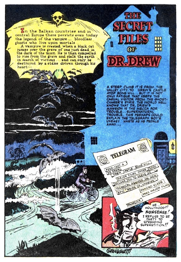
According to the THOIA Archive, I haven't posted a Dr. Drew story since 2016. Time to correct that oversight! And what better tale to unearth for our Friday Fright this week (and as we slowly approach the release of my new Vampires one-shot for Asylum Press) than one about an undead blood sucker loose on a film set in horrible 'ol Hollywood! Now, if you've read the other Dr. Drew entries, you already know how great Jerry Grandenetti's artwork is: lush, Eisner-esque, cinematic, and dynamically detailed with all sorts of interesting angles and breathtaking page lay-outs-- and this one from the April 1950 issue of Ranger Comics #52 is certainly no exception! Be sure to CLICK HERE for more spooky Dr. Drew after today's story!


Sometimes I think that, in this Eisner-esque stuff, the subjects can disappear into the details. I really liked page four though--the bats chasing Sable up the set stairway is a really great panel--and the rest of the page layout supports it very well. But I feel like the editor must have added that descriptive caption at the last minute, cause it really throws everything out of wack.
ReplyDeleteIt is true that the Balkans probably have more in the way of vampire history than just about anywhere. I love it when that trivia pops-up in stuff like this.
Wait, it's Friday again already? Aces!
It was always a bit amazing that we didn't see a lot more people doing the Eisner type layouts. You can see why, because as Mr. Cavin said, you can sometimes get the characters lost in the cleverness of the layout, and then it's not good story telling.
ReplyDeleteEisner, of course, was an expert, but Grandenetti does good work here. The little inserts shots in page 6 work great with the flow, and the crashing panel on the last page are great pieces of work. I really like the staging there, though there's a bit of confusion where the chandelier suddenly comes in.
The film strip bit is a good gag!
A nice piece of work. Really enjoy this guy's work.
Yep. Pandro Kleeg's (pander & klieg, get it?) entrance is pure Eisner. I caught a slight whiff of Jack Cole, too.
ReplyDeleteI like how the story sets up its own vampire mytholgy. No wonder animal shelters should not be set up near graveyards.
Amazing how Grandenetti was able his to modify his overall style away from the Eisner look well into the silver age, and still be as weirdly detailed and even more original than ever. Thanks for the comments
ReplyDelete