
Another recent deep dive into a big ol dusty box of vintage antique mall ephemera produced a great 1950's or 60's Las Vegas brochure direct from The Sands "Showplace of the Stars", --from an era where legendary Dean Martin was doing his dynamo Dino act. And wow, as you continue opening the brochure it just gets better and better, full of great illustrations for other classic Sands highlights: the casino, pool, nightclubs, and dining. And gosh, I super love that light blue / gold color combination of the brochure design too. Now, as if all of this wasn't enough, flip the brochure over and right there on the backside, scribbled in blue ink, what do we find? Only Dean Martin's actual autograph! I've compared it to other examples of his signature online and it appears to be authentic. What a score for 50 cents, eh?


4 comments:
That is the find of the month, Karswell.
Of the seventeen stars on the cover, I could only think of the names of nine of them off the top of my head.
Maybe a follower of AEET can name them all without looking online.
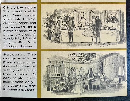
The Chuckwagon, offering food from Midnight until dawn, perfect for night owls and insomniacs.
A great memento from the golden age of Vegas, thanks for sharing.
Ha ha, regarding the cover: I don't recognize hardly any of them! I mean, I'm not even sure which ones are the less-famous rat Pack heads.
I always dig it when brochures like this use what I consider unfinished art in such a clever way. This stuff is mostly sketchpad stuff--possibly done in conté or charcoal, maybe with some quick marker--but it looks super good half-toned and printed in (or with) spot color. It's one of my favorite looks, since I often prefer the urgency of original drawings to the overworked and over-polished finishes most illustration gets subjected to before printing.
This would be a great find even without the autograph.
I recognize maybe 50% or them?
I have to say, and I assume it's because it was cheaper to produce, the sketchy art is kind of a weird thing. I mean, you'd think you want to show photos so you could see how grand the place was for the time.
I like the style, but it doesn't give me that "must visit" vibe.
The signature, now that's worth 50 cents!
>you'd think you want to show photos so you could see how grand the place was for the time
That's an odd way to look at stylized artwork considering how often its implemented in nearly all types of brochures, advertising, books, mags, etc. Do you say the same thing with food when this artistic approach is used in cook books?
Okay, here's my best attempt at the cover faces (those first two in the bottom row that I can't figure out are driving me crazy):
LEFT TO RIGHT TOP ROW:
Nat King Cole, Jerry Lewis, Lena Horne maybe?, Frank Sinatra, Danny Thomas, Dean Martin, Red Skelton, Sammy Davis Jr.
LEFT TO RIGHT BOTTOM ROW:
Steve Rossi & Marty Allen, ???, ???, ???, Louis Armstrong, Joey Bishop, George Gobel
Post a Comment